Plotting the age of parliament with Livebook
Koen van Gilst / November 24, 2022
8 min read • ––– views
I've been meaning to give Livebook, an interactive coding notebook for the Elixir programming language, a try, and on Twitter, I recently came across the perfect opportunity. A tweet by the data journalist Walter Hickey alarmingly noted that the percentage of congress members who are over 70 is increasing exponentially. This caught my interest, and I wanted to see if the same is also true for my home country, the Netherlands.
In this tutorial, I'll go over the steps needed to retrieve, prepare, and visualize the data in an Elixir Livebook. In the end, you should be able to visualize the average age of politicians from other countries as well. The corresponding Livebook can be found here.
I'll be using the following libraries.
- vega_lite, which allows us to define our visualizations in Elixir.
- kino_vega_lite, which instructs Livebook how to render.
- jason a library for parsing JSON.
Getting the data from Wikidata
To retrieve the data I used Wikidata's query engine which is provided free of charge. Wikidata uses the SPARQL query language, which is a powerful language in and by itself. It's somewhat similar to SQL, but it did take me some time to familiarize myself with the syntax.
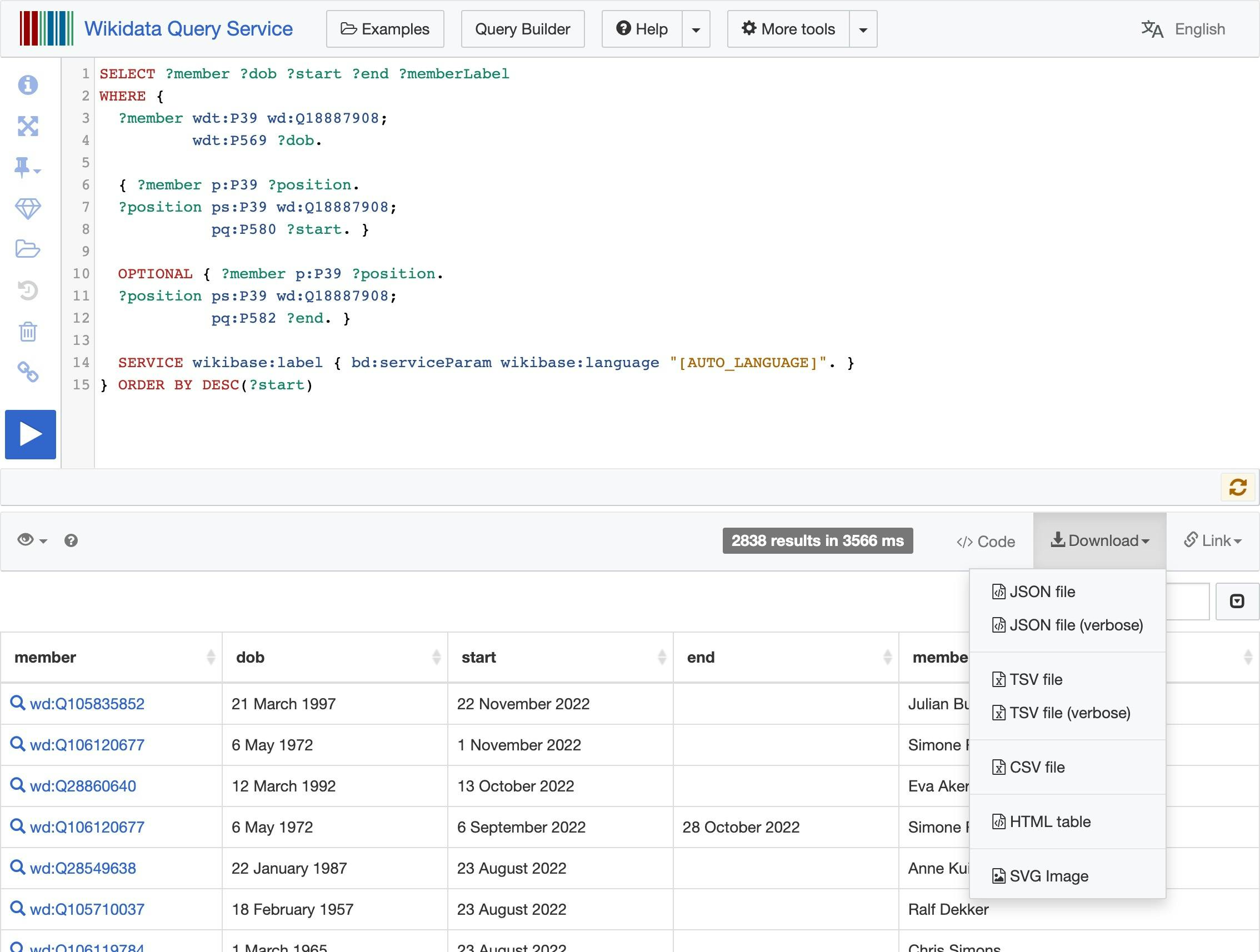
I came up with the following query to retrieve all the members of the Dutch house of representatives:
SELECT ?member ?dob ?start ?end ?memberLabel
WHERE {
  ?member wdt:P39 wd:Q18887908;
          wdt:P569 ?dob.

  { ?member p:P39 ?position.
  ?position ps:P39 wd:Q18887908;
            pq:P580 ?start. }

  OPTIONAL { ?member p:P39 ?position.
  ?position ps:P39 wd:Q18887908;
            pq:P582 ?end. }

  SERVICE wikibase:label { bd:serviceParam wikibase:language "[AUTO_LANGUAGE]". }
} ORDER BY DESC(?start)
In English the above query would read something like this:
Give me a list of everyone who has held a position as a member of the Dutch House of Representatives. Of those persons return the start time (ie. date of birth). And of the position held by that person the start and end time. The end time is optional and can be empty.
The results of the query look something like this in my case:
I saved the results of the query in a JSON file. This file is also stored in the Github repo for this Livebook.
Loading the data
The next step would be to load the data into our Livebook. This was a little trickier than I expected. You have to use the __DIR__ prefix to get the path of the current working directory (where the Livebook is stored). I would've expected ./name_of_json.json to work.
To verify our results we can filter on the name of our current Prime Minister, Mark Rutte. He was part of 5 parliaments and after forming a coalition he immediately leaves parliament again to become Prime Minister.
members =
  "#{__DIR__}/members_of_dutch_parliament.json"
    |> File.read!()
    |> Jason.decode!()
  # |> Enum.filter(fn m -> String.contains?(m["memberLabel"], "Mark Rutte") end)
Output:
[
  %{
    "dob" => "1997-03-21T00:00:00Z",
    "member" => "http://www.wikidata.org/entity/Q105835852",
    "memberLabel" => "Julian Bushoff",
    "start" => "2022-11-22T00:00:00Z"
  },
  %{
    "dob" => "1972-05-06T00:00:00Z",
    "member" => "http://www.wikidata.org/entity/Q106120677",
    "memberLabel" => "Simone Richardson",
    "start" => "2022-11-01T00:00:00Z"
  }
  ...
Formatting the data
To make sure that the data is in a form that we can easily plot, we're going apply the following transformations to the original data. We will:
- remove the
memberproperty which contains a link to the Wikidata entry - parse the date strings
- use 2022 as a fallback in case the end date is not defined
parse_date = fn date_str ->
  [year, month, day] = date_str
    |> String.split("T")
    |> List.first()
    |> String.split("-")
    |> Enum.map(&String.to_integer(&1))

  Date.new!(year, month, day)
end

members = members
  |> Enum.map(
    &Map.new(
      memberLabel: &1["memberLabel"],
      dob: &1["dob"] |> parse_date.(),
      end: (&1["end"] || "2022-12-31") |> parse_date.(),
      start: &1["start"] |> parse_date.()
    )
  )
Output:
[
  %{dob: ~D[1997-03-21], end: ~D[2022-12-31], memberLabel: "Julian Bushoff", start: ~D[2022-11-22]},
  %{
    dob: ~D[1972-05-06],
    end: ~D[2022-12-31],
    memberLabel: "Simone Richardson",
    start: ~D[2022-11-01]
  },
  %{dob: ~D[1992-03-12], end: ~D[2022-12-31], memberLabel: "Eva Akerboom", start: ~D[2022-10-13]},
  %{
    dob: ~D[1972-05-06],
    end: ~D[2022-10-28],
    memberLabel: "Simone Richardson"
  ...
Creating a list of active years for every member
To get an idea of how the average age of members of parliament has changed over time we'd have to plot the years on the x-axis. On the y-axis, we'd like to see the average age of the members.
To make this happen we have to transform the list of members to a list of years on the one hand, and every member that was in parliament on the 1st of January of that year on the other hand.
Note: We could have taken any date during that year, but it is important to pick a specific one.
defmodule Filter do
  def active_members(members, year) do
    members
      |> Enum.filter(&active?(&1.start, &1.end, year))
      |> Enum.map(fn m -> %{year: year, member: m} end)
  end

  defp active?(start_date, end_date, date) do
    Date.compare(start_date, date) != :gt and Date.compare(end_date, date) != :lt
  end
end

members_per_year = 1850..2022
  |> Enum.map(&Date.new!(&1, 1, 1))
  # for every 1st of January of a year, get a list of members active in parliament on that day
  |> Enum.map(&Filter.active_members(members, &1))
  |> List.flatten()
Output:
[
  %{
    member: %{
      dob: ~D[1807-11-14],
      end: ~D[1850-08-20],
      memberLabel: "Schelto van Heemstra",
      start: ~D[1849-11-19]
    },
    year: ~D[1850-01-01]
  },
  %{
    member: %{
      dob: ~D[1804-04-29],
  ...
Adding ages per year
We now have a nice list of the year, member pairs. The only thing that is still missing, is the age of every member at that time. Let's replace the member maps with the age.
age = fn birth_date, date ->
  Date.diff(date, birth_date) |> div(365)
end

ages =
  members_per_year
  |> Enum.map(&Map.new(year: &1.year, age: age.(&1.member.dob, &1.year)))
Output:
[
  %{age: 42, year: ~D[1850-01-01]},
  %{age: 45, year: ~D[1850-01-01]},
  %{age: 56, year: ~D[1850-01-01]},
  %{age: 41, year: ~D[1850-01-01]},
  %{age: 48, year: ~D[1850-01-01]},
  %{age: 53, year: ~D[1850-01-01]},
  %{age: 32, year: ~D[1850-01-01]},
  %{age: 40, year: ~D[1850-01-01]},
  %{age: 48, year: ~D[1850-01-01]},
  %{age: 45, year: ~D[1850-01-01]},
  %{age: 38, year: ~D[1850-01-01]},
  %{age: 33, year: ~D[1850-01-01]},
  ...
Plotting
Our data is now ready to be visualized. Let's start with a simple scatter plot, showing all the members of parliament and their ages over the years.
Vl.new(width: 800, height: 400, title: "Age of Dutch parliament", view: [fill: "#040506"])
  |> Vl.data_from_values(ages)
  |> Vl.mark(:point, color: "#53ceff")
  |> Vl.encode_field(:x, "year", type: :temporal)
  |> Vl.encode_field(:y, "age", type: :quantitative)
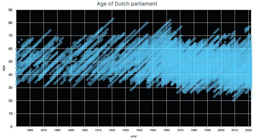
As you can see, around 1950 the density of the circles increases. That makes sense, as around that time the number of members in parliament increased from 100 to 150.
The next step would be to plot the average age. We could do that using Elixir code, but the plotting library VegaLite is also perfectly capable of doing that.
Vl.new(
    width: 800,
    height: 400,
    title: "Average age of Dutch parliament",
    view: [fill: "#040506"]
  )
  |> Vl.data_from_values(ages)
  |> Vl.mark(:line, size: 5, color: "#53ceff", tooltip: true)
  |> Vl.encode_field(:x, "year", title: "Year", type: :temporal, time_unit: :year)
  |> Vl.encode_field(:y, "age", aggregate: :mean, scale: [domain: [0, 70]])
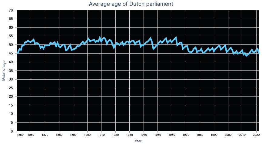
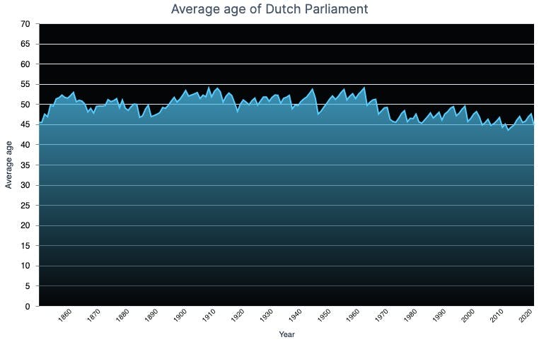
Looking at the plot it seems like the Dutch parliament is getting younger instead of older. Pfew, no gerontocracy in my country!
Conclusion
In this post, I've shown how you can use Livebook to explore data. We started by loading the data from a JSON file, transforming it and then visualizing it using the VegaLite plotting library. I hope you enjoyed this post and that it gave you some inspiration to try out Livebook yourself.
Bonus
Even nicer visualizations
I've already tried to customize the way the visualization looks by changing the colors, but I also wanted to add a gradient below to line graph to make it look even nicer. It turns out that this is not possible using the standard DSL of VegaLite in Livebook. You can, however, use an escape hatch: from_json.
This offers the possibility to use a standard VegaLite JSON configuration. This way, anything that is possible within the VegaLite editor is also possible in Livebook. Below this JSON config, you can use Vl.load_from_values() to load the data from the notebook.
Vl.from_json("""
{
  "width": 700,
  "height": 400,
  "title": "Average age of Dutch Parliament",
  "view": { "fill": "#040506" },
  "config": {"view": {"stroke": null}},
  "mark": {
    "type": "area",
    "tooltip": true,
    "line": {
      "color": "#53ceff",
      "size": "2"
    },
    "color": {
      "x1": 1,
      "y1": 1,
      "x2": 1,
      "y2": 0,
      "gradient": "linear",
      "stops": [
        {
          "offset": 0,
          "color": "#040506"
        },
        {
          "offset": 1,
          "color": "#53ceff"
        }
      ]
    }
  },
  "encoding": {
    "x": {
      "field": "year",
      "title": "Year",
      "type": "temporal",
      "axis": {"domain": false, "grid": false, "ticks": false, "labelAngle": -45}
    },
    "y": {
      "field": "age",
      "title": "Average age",
      "type": "quantitative",
      "aggregate": "mean",
      "scale": { "domain": [0, 70] }
    }
  }
}
""")
|> Vl.data_from_values(ages)